


Button Design
Visual Style
Soft shadow, subtle animated gradient, and rounded edges give it a modern, elevated look.
Interaction
Hover shrinks the button slightly. On click, the shadow disappears to create a pressed-in effect.
Content & Flow
Clear label, centered alignment, and spacing that makes it easy to tap or click.
Adaptability
Designed to hold up across different dark layouts and backgrounds without losing clarity.
Login Component
A soft-glow login form made for dark interfaces, placed over a looping aurora video background.
Visual Style
Frosted glass effect using bg-white/5 and text-white/80 keeps the content readable without blocking the background. Tailwind's opacity classes let it blend cleanly over video, textures, or images.
Interaction
Hover and focus states give subtle feedback. Button includes animated loading state when clicked.
Content & Flow
Clear spacing, strong CTA, and helpful links like "Forgot password" and "Register" in expected spots.
Adaptability
Responsive layout. Background-aware color choices keep it readable over textures, photos, and video.
Custom Made Card
Frosted Glass UI
The card and spotlight effect was designed in Figma. The frosted glass effect is applied using the Tailwind's backdrop-blur-md. I also used the React <Image> component, which makes it easier to apply Tailwind classes and effects like overlays while keeping the image responsive and optimized.
Toggles
Notifications
Receive push notifications
Dark Mode
Use dark theme
Enhanced Security
Enable two-factor authentication
WiFi
Connect to wireless networks
Performance Mode
Optimize for speed and efficiency
Loading States
Microinteraction
I designed this microinteraction with a smooth hover and press animation to give users instant feedback and make the button feel more responsive.
By using Framer Motion, I created fluid transitions that feel modern and polished, showing my focus on details and creating small moments of delight in the experience.
Navbar

Ad Design Concept
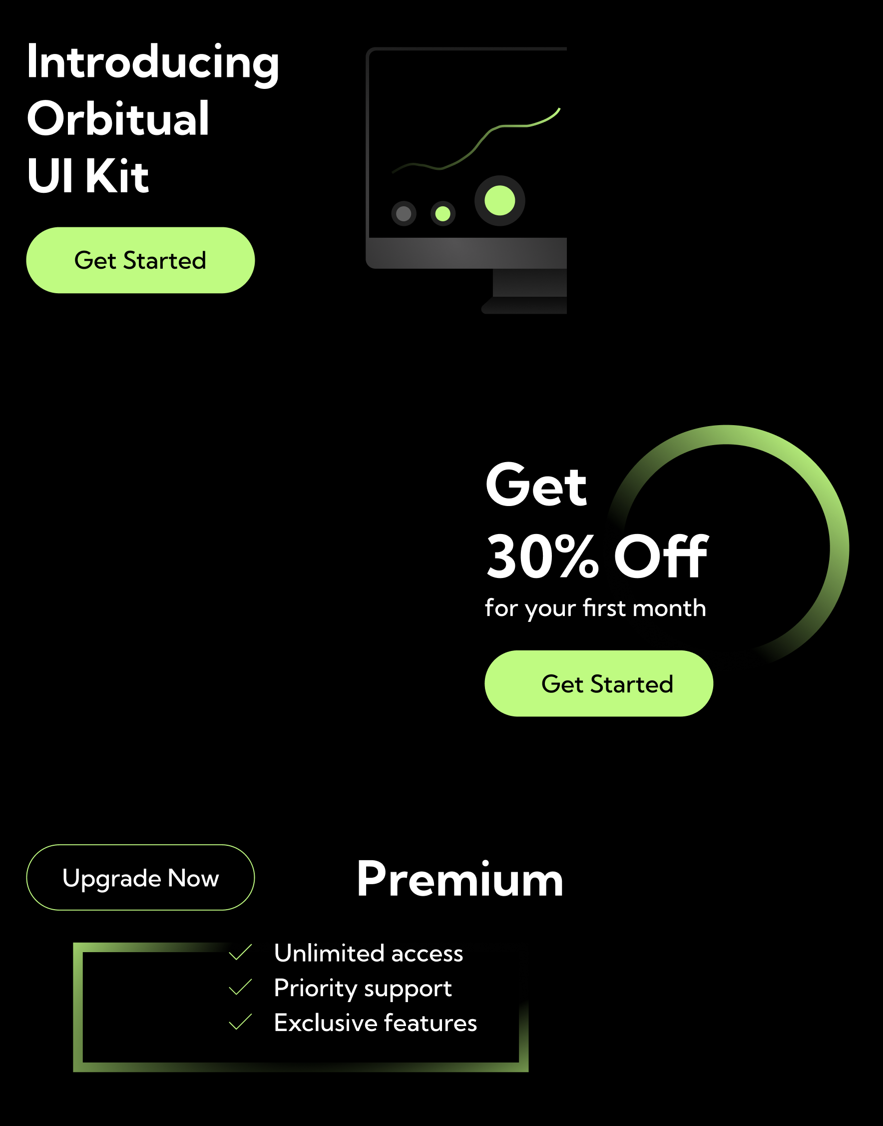
The ad design above was created as a demo concept to showcase UI kit marketing visuals. The goal was to explore clean layouts, contrast, and conversion-focused design within a dark theme. The project focused on practicing pricing layouts, CTA hierarchy, and modern promotional components.
Calculator
A calculator built with the button design showcased above, highlighting how the component integrates into a functional interface. When active, the AC button turns into a backspace button until result is given.
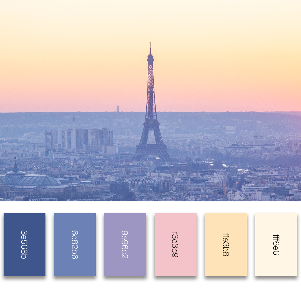
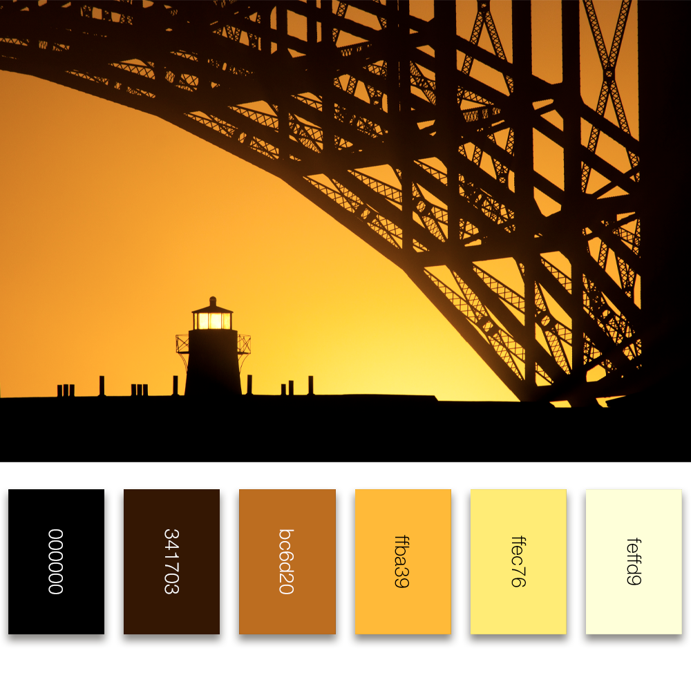
Color Palettes
Each palette was created from real-world photos to keep the mood grounded in natural, believable color. Used with color theory, these swatches support contrast, accessibility, and consistency across layouts.
Visual Style
Colors are extracted directly from imagery to create depth, warmth, and balance in UI themes.
Design System Use
Each set is ready to drop into a Tailwind-based design system for components, backgrounds, text, and states.
Accessibility
Palettes are tested for contrast clarity and can support light or dark interfaces with minimal adjustments.
Aurora Effect — Real-Time Shader Animation
A custom-built visual that uses WebGL and GLSL shaders to merge design and GPU-level programming. This experiment recreates a living aurora borealis through mathematical noise and dynamic color blending.
The effect shows my ability to bridge creative design and real-time rendering. It creates experiences that feel immersive and alive. I use React, OGL, and custom GLSL shaders, and the result runs fully on the GPU at a smooth 60 FPS across modern browsers.
News Banner
HUMANS HAVE LANDED ON MARS
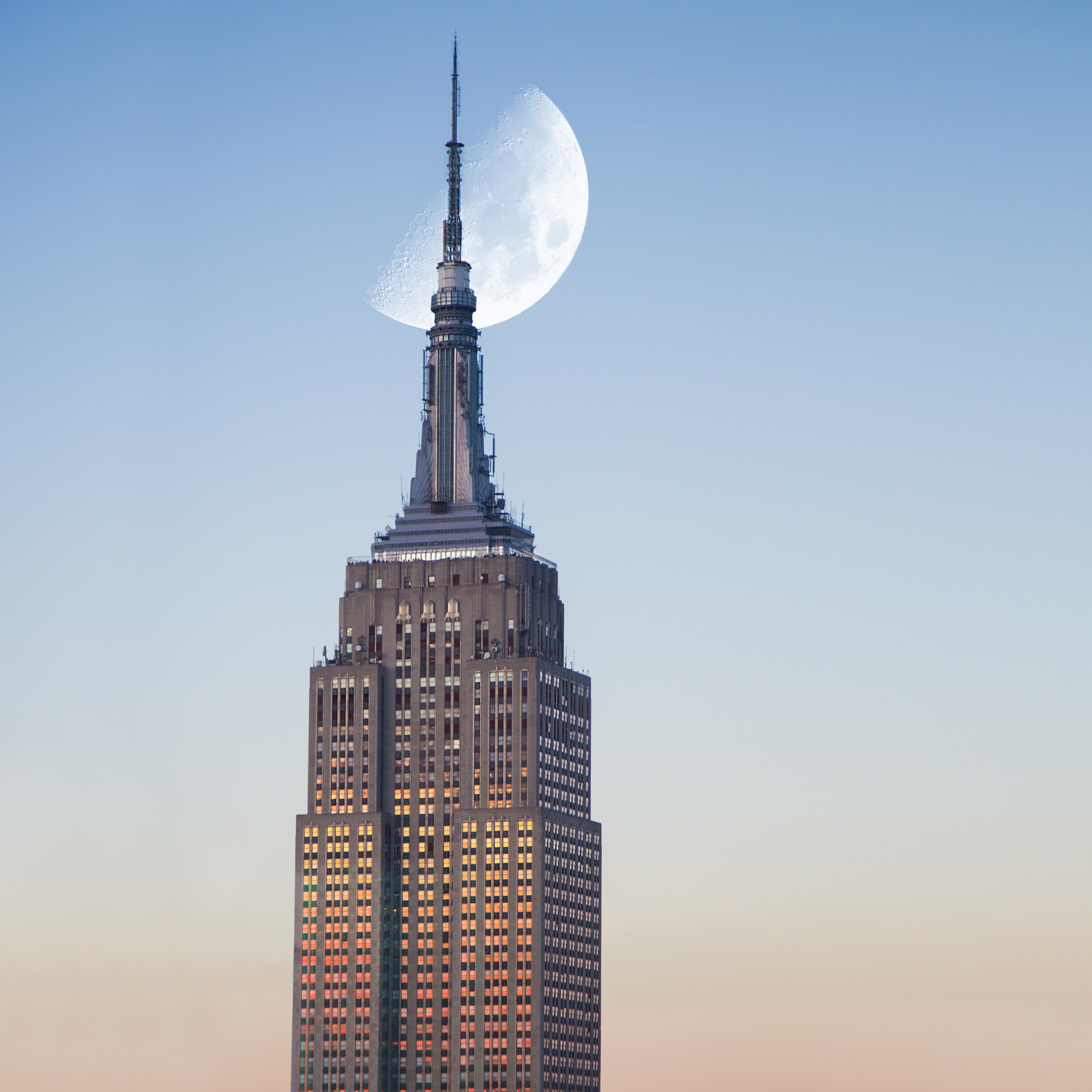
ESB Photo Contest Finalist
On display at Empire State Building